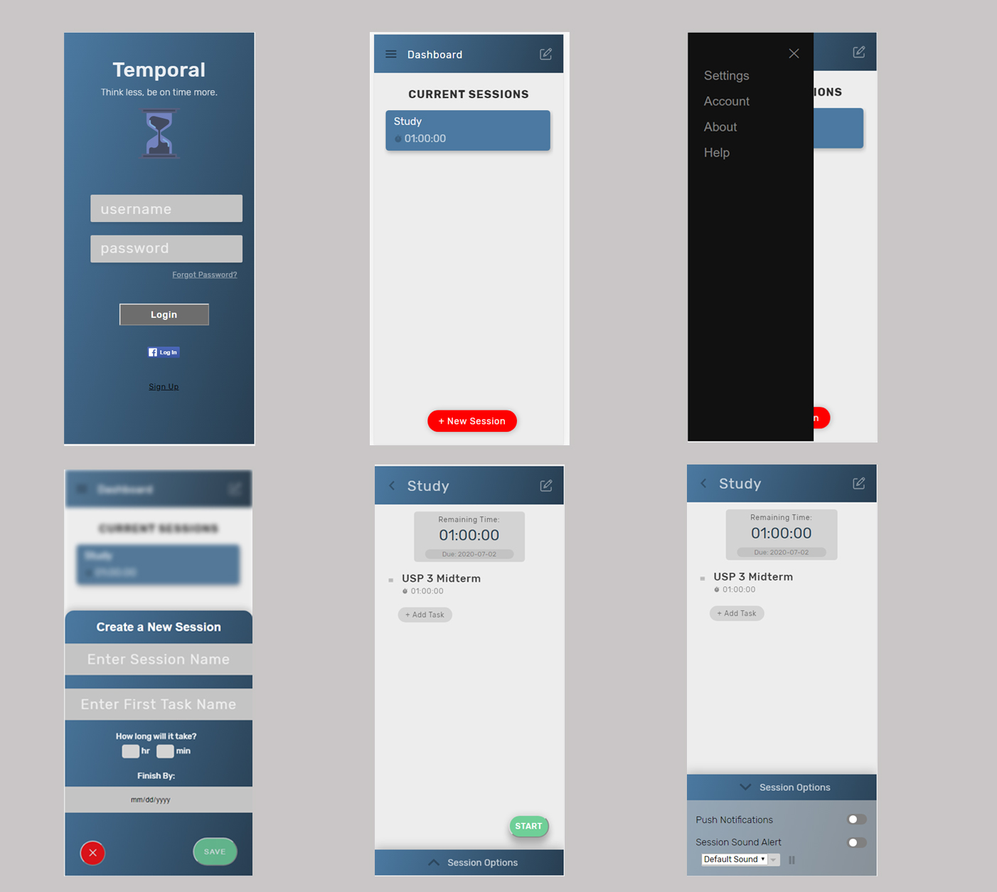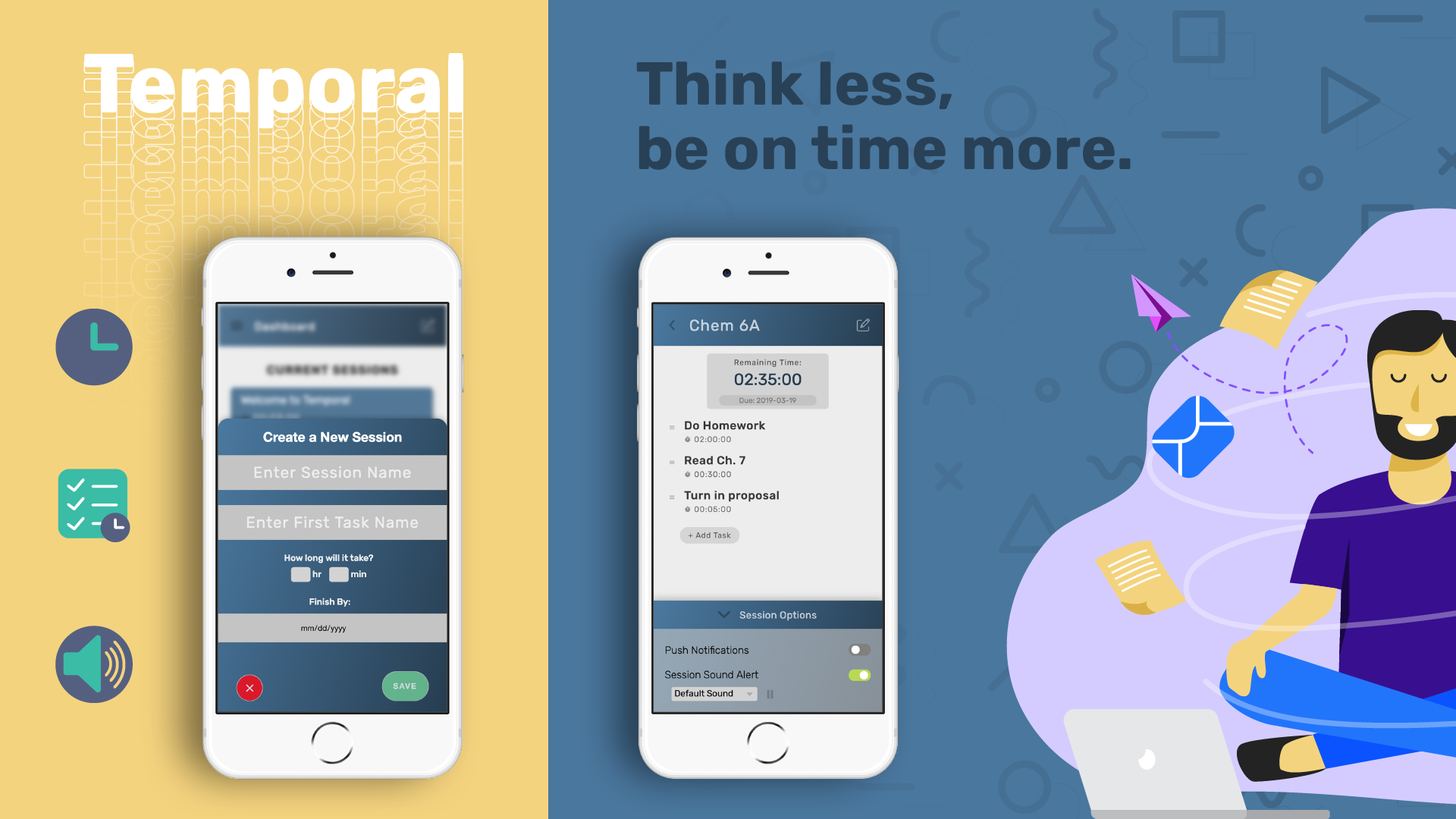
A school project where we made a task management app that uses timers and sounds, using the technolgies of NodeJS and Express.
- Timeline Jan 2019 - Mar 2019
- Team Dan Tran, Johnathan Tran, Angelica Ramos
- Role UX Designer & Full Stack Developer
- Technologies NodeJS, Express, Figma, Google Analytics
- UX DesignFigma Prototype
- CodeGitHub Repository
Table of Contents
Overview/Background
Oftentimes, people encounter scenarios where they are overwhelmed with work. Sometimes, they don't manage their time efficiently and procrastinate to the last minute. When tasks are so easy, people would do them later. When these tasks build up, it can cause unnecessary stress. When people are stressed, they are more distracted and become less productive.
However, after talking to several college students, we found that allocating time into tasks ahead of a deadline could resolve procrastination. However, many apps don't include a timer to track how much time is done within the tasks. Some can do it implicitly by creating a mental timer. However, it is hard to keep track and is unreliable. Many people would have a hard time doing it mentally. When there's a big task, a person could split it into smaller tasks and split the time it takes. If one finishes a task ahead of their estimated time, they could move on to the next task or find out they have extra free time. If one cannot finish a task in their estimated time, they could add more time and roughly guess how much time they need before finishing. As a result, proper time management is key in finishing work effectively.
In one course in Interaction Design, I worked with two other people to create a mobile web application that helps the user manage tasks through the use of timers, lists, and sound feedback. We learned how the design process works, such as needfinding, prototyping, designing the app, and user testing.
Problem Statement
Many college students encounter the problem of being overwhelmed when they don't manage their time efficiently. Usually, people won't remember all the due dates and the estimated times it takes to finish before the deadline.
User Research & Needfinding
We interviewed several college students about procrastination. Afterwards, we observed them studying. We observed some breakdowns, such as being distracted by their phone. Some questions we asked were if procrastination was preventable and why they felt that way.
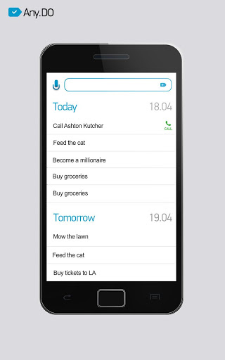
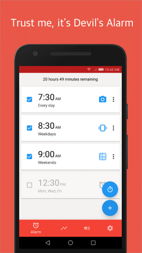
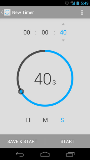
We drew inspiration from popular apps that are involved with tasks or time. We looked at any.do for how it keeps track of tasks. We looked at the UX of Android's timer. We looked at Alarmy's simple list design and how they used icons to fit everything within one block.
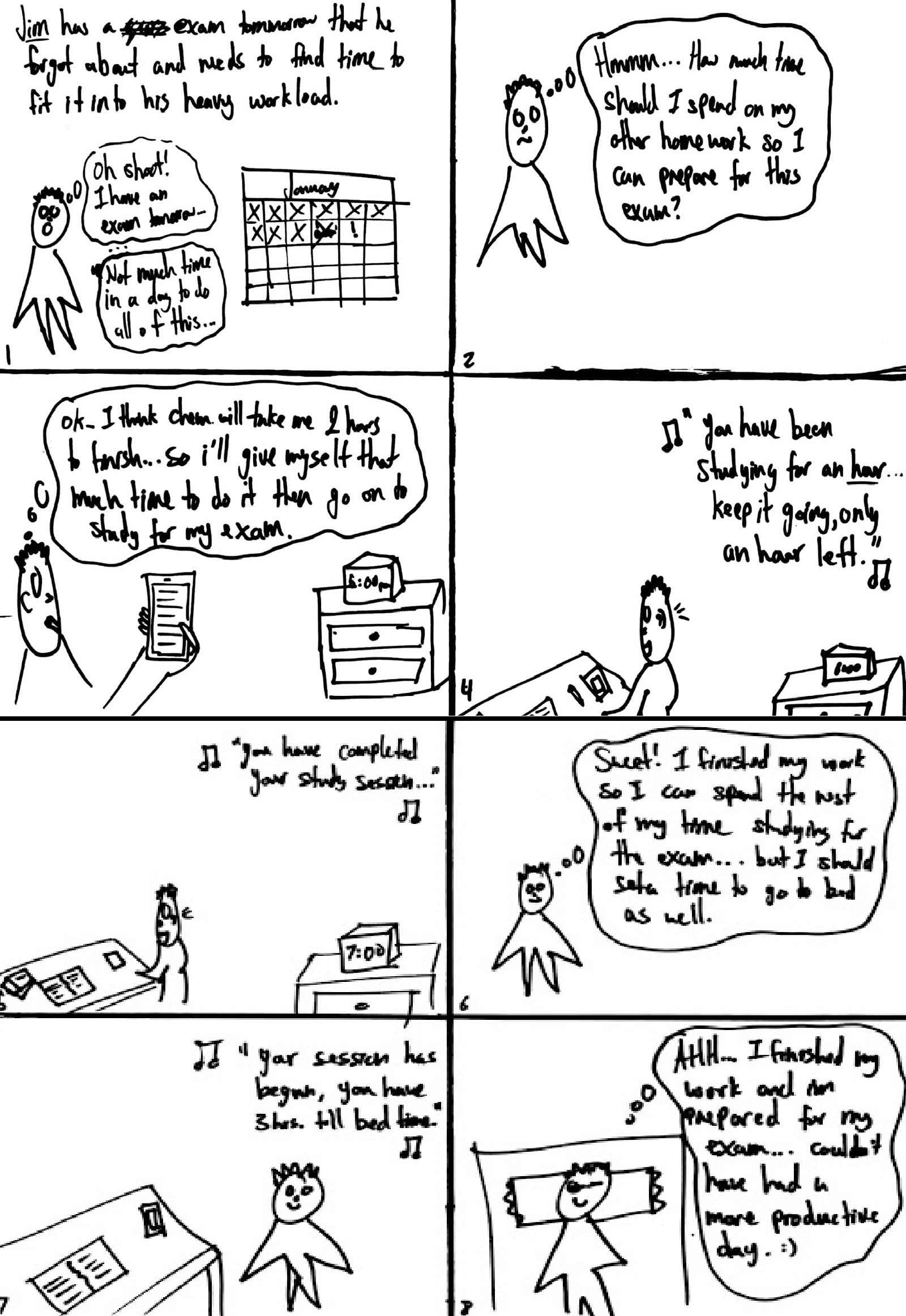
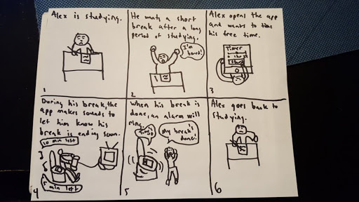
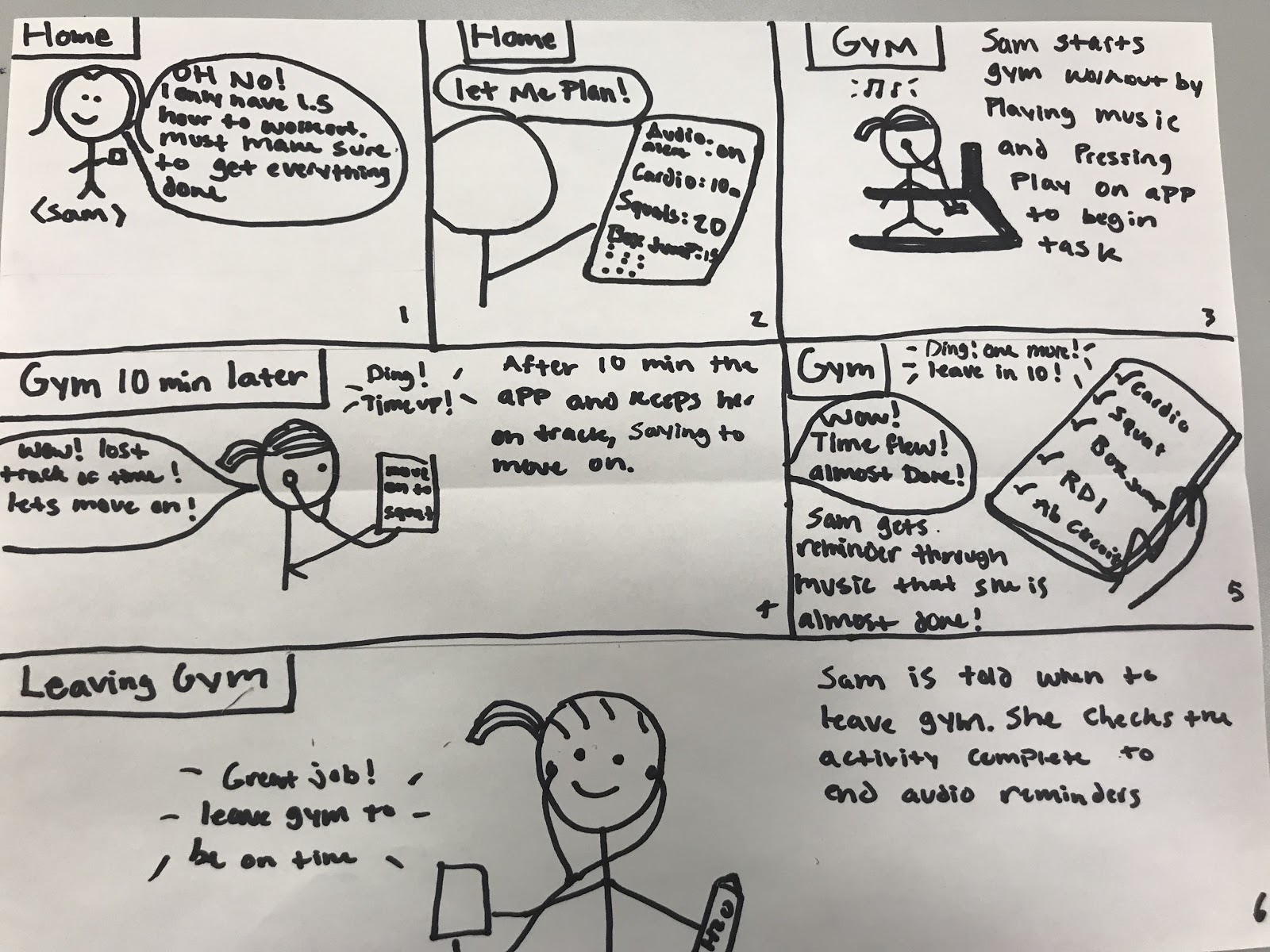
Storyboards
We created storyboards for three different scenarios: studying for an exam, taking a break, and exercising!
Prototypes
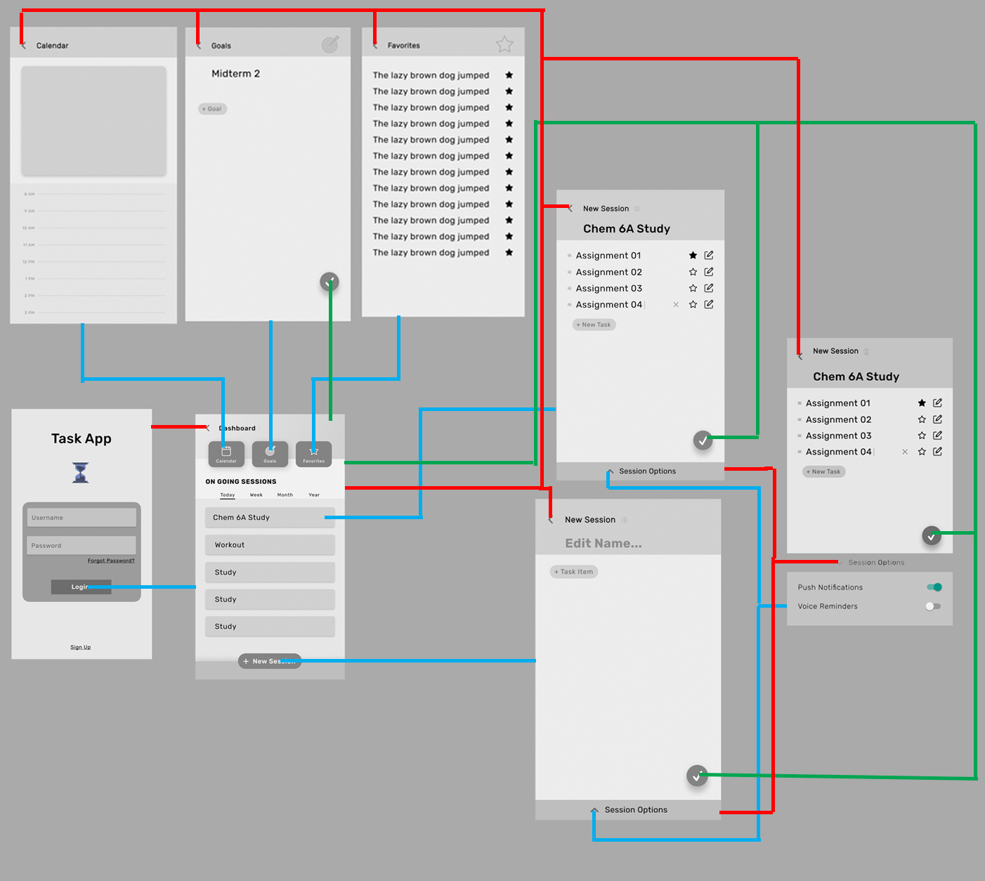
We started designing our app with two low-fidelity prototypes. Prototype 1 has a more boxy, modern feel, while Prototype 2 has a simple look that's easy to navigate. Prototype 1 included a goals section and a calendar section. Prototype 2 has notifications when it's getting closer to the time running out.
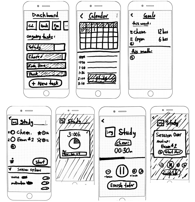
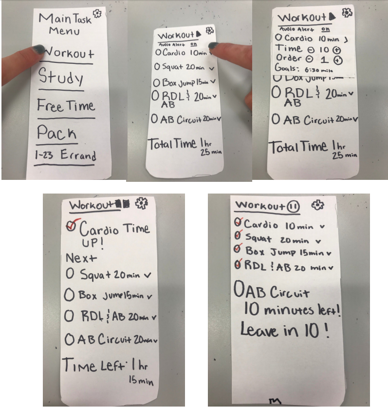
We liked a lot of the designs in Prototype 1, but we liked the simplicity of Prototype 2.
User Testing
After making our paper prototypes, we needed to test to see if it made any sense to someone unfamiliar with our product. We gave several of our peers (~5 people) the paper prototypes and hoped that they could navigate it without getting confused. During the test, our peers did heuristic evaluations, using Neilsen's 10 Design Heuristics. Some changes that we did based on the feedback are:
- Cosmetic changes to the UI by spacing things apart more for a more minimalist look
- Add some more user control by adding a back/undo button
- Adding a help/documentation page to make the user more familiar with the app if they’re confused
After making the first version of the app, we did user testing from three peers. We found some common themes amongst our different users. We noticed there was an inconsistency with intuitive language on the task card, lack of user freedom when navigating the session page, and slight confusion on the purpose of menu bar tasks. We anticipated some of our design choices to be intuitive to them, but we were wrong. We believe users had a lack of user freedom because we had not fully implemented all the functionality we wanted. One user tried to fully explore the session page feature and could not figure out how to edit or delete tasks, making them feel stuck.
We also did A/B testing to see if certain design choices were better than another. Some changes we did were:
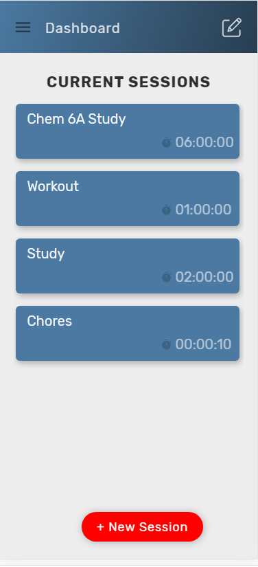
- A new color for the new session button
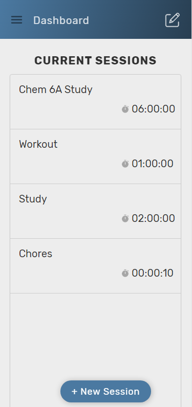
- Change the “Current Sessions” list to a card styled list rather than our stacked list of sessions
Final Product Design and Results
It's amazing to see create an idea with scratch through collaboration. Even with scheduling problems and coding errors, we created something that came from a simple need. The idea moved onto being visualized into paper, then into computer graphics, and then into a functional webapp.
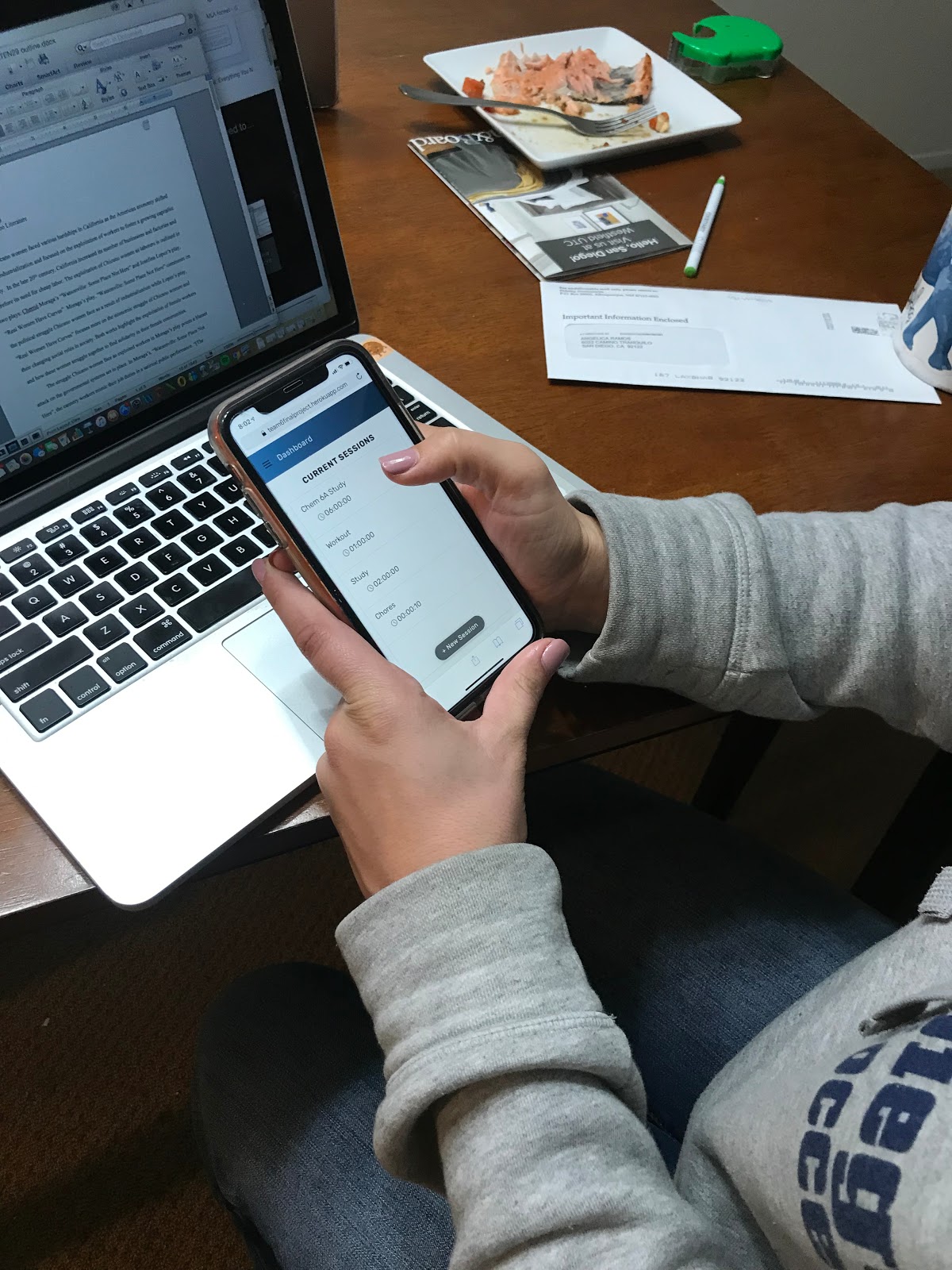
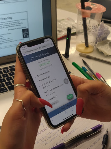
In the end, we made the app, but it isn't fully functional. We had several weeks to code the app, but it wasn't enough. Although the timer works, there were some huge problems, such as not pausing properly. We made sound work, but the user can't customize the sound they want. We didn't implement all the style changes perfectly. We had to drop the implementation for the goals and calendar sections. Despite these problems, it was a good experience to understand what it was like to be in a team and design a web app.