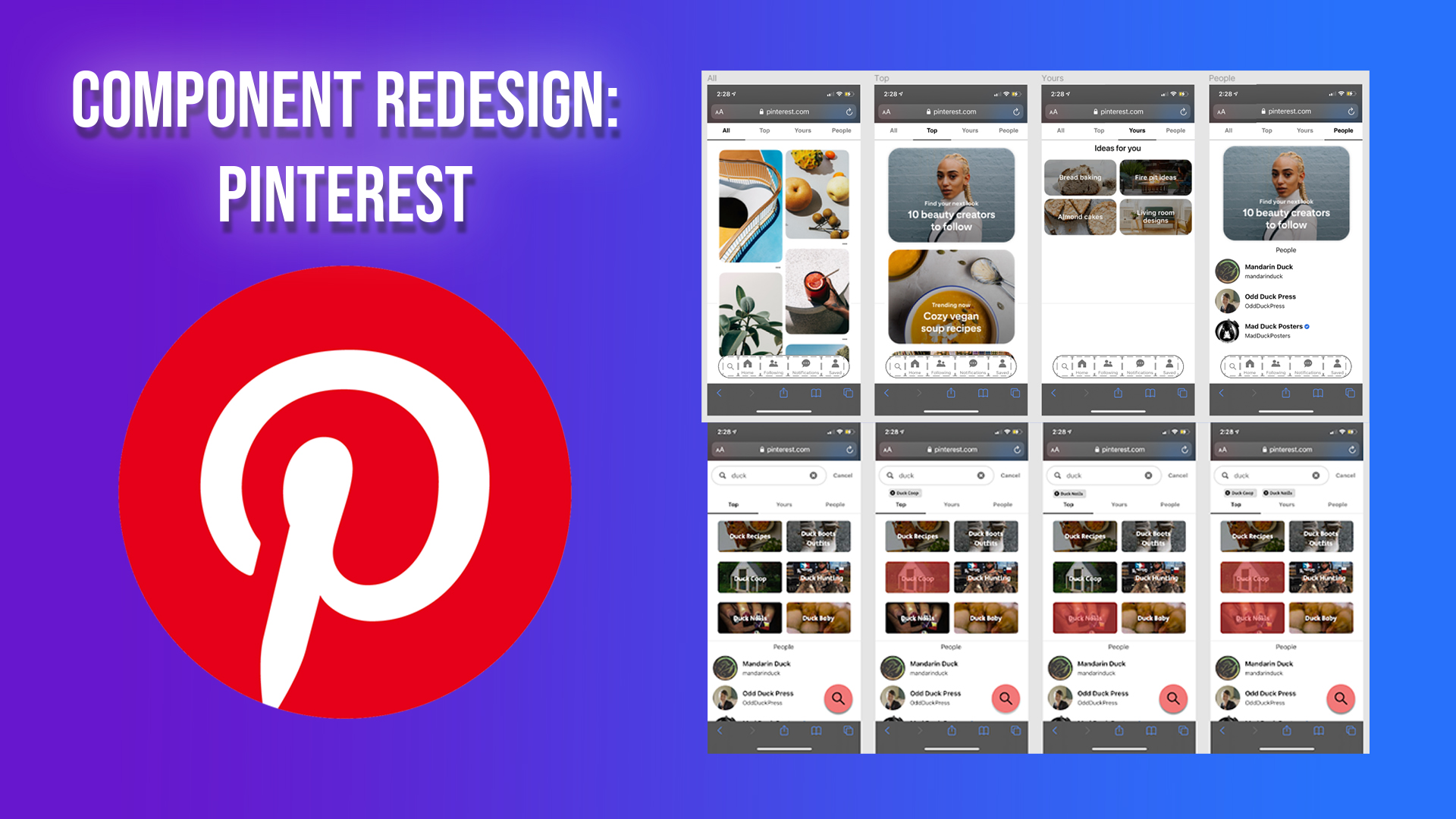
A school UX project that offers an alternative approach to Pinterest's design on its search component in 2020. Involves user testing and UI Design.
- Timeline Nov 2020 - Dec 2020
- Team Dan Tran, Ryan Wey, Osvaldo Vasquez-lara, Henry Pham-Tran
- Role UX Designer & User Researcher
- Technologies Figma, User Testing
- UX DesignFigma Prototype 1 Figma Prototype 2
Table of Contents
Overview/Background
Disclaimer We do not work with Pinterest nor are we associated with them. We did this for a school project.
Pinterest is a unique social media app that shows images to preview content of other sites. It is used to find inspiration for ideas, such as finding unique fashion trends or getting ideas to draw something. The feed layout is visually appealing and useful because it helps users quickly glance at ideas that they want. Once they find an idea they like, they can save it as a “pin” and save it into a “board”. This concept enables users to keep a collection of inspirations and ideas that can be referred to later for work, hobbies, or other things.
We chose to redesign Pinterest because we liked how different Pinterest was to other social media apps and wanted to challenge ourselves in doing a redesign of a popular app.
In one course of interaction design, I worked with three other people to redesign the search component of Pinterest. In this project, we learned how to create prototypes that utilized a redesigned component to solve user problems we noticed from the original app with the analysis of user testing and competitors. We redesigned the search component because we noticed that users ignored some of the core features and saw unneeded features. Although we did changes, it ultimately came back to users preferring the original component.
I was primarily responsible for the component redesign and competitor analysis. I was also primarily responsible for the user testing plan for the prototypes. Additionally, I also interviewed and took notes for some of the users. I also chimed in ideas for the sketches and made sure the high-fidelity prototypes were functional.
User Testing - Pinterest
In the user testing process, we found five users (primarily college students). Most users had minimal interaction with Pinterest, while one was familiar with it. For every user we tested, we had an observer and a guide. Our guide asks the users questions to answer and gives tasks for users to do. Our observer noted any confusion that a user might have while they are doing tasks.
We made a group of questions and tasks for users to navigating Pinterest's mobile site. Some of these questions and tasks include:
- A person's familiarity with the app (e.g. Do you use Pinterest?)
- Using the app (e.g. Can you get inspiration ideas from anything you're interested in?)
- Impression of Pinterest (e.g. What do you think the purpose of Pinterest is?)
Based on our testing, we found that users didn't have much trouble navigating the website. Users had no trouble going to where they needed to go and endless scrolling didn't frustrate them. Most users knew how to create boards and save pins.
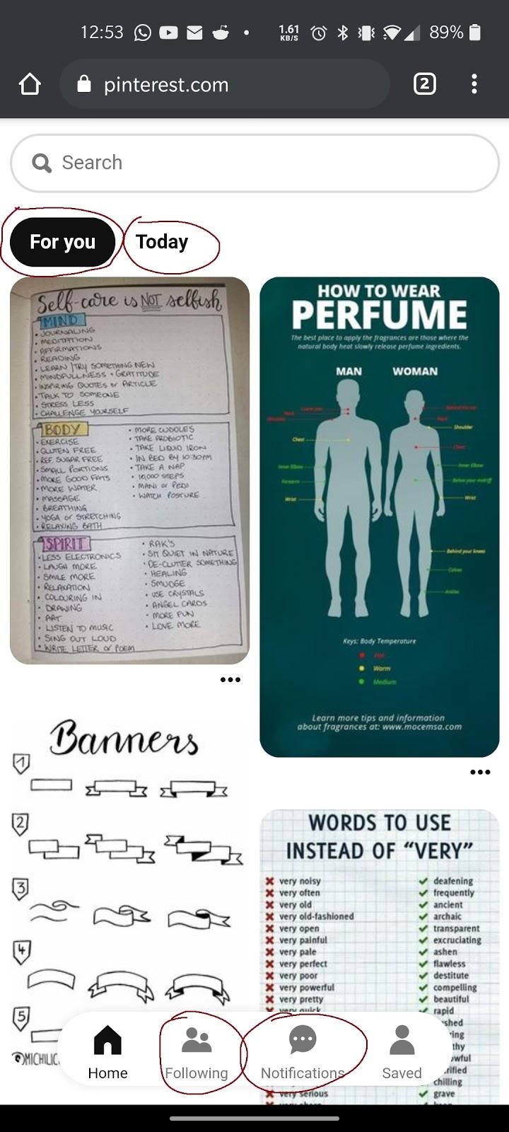
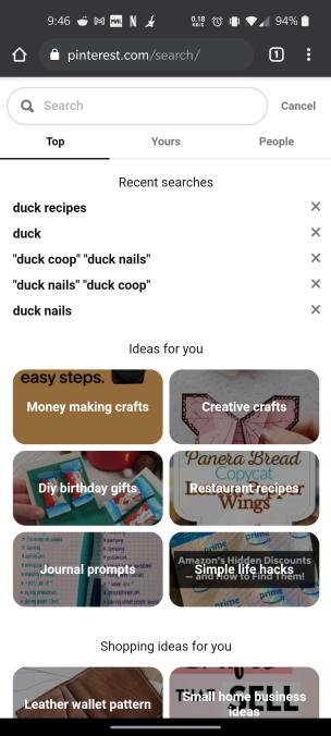
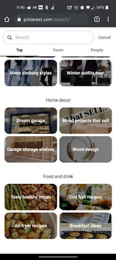
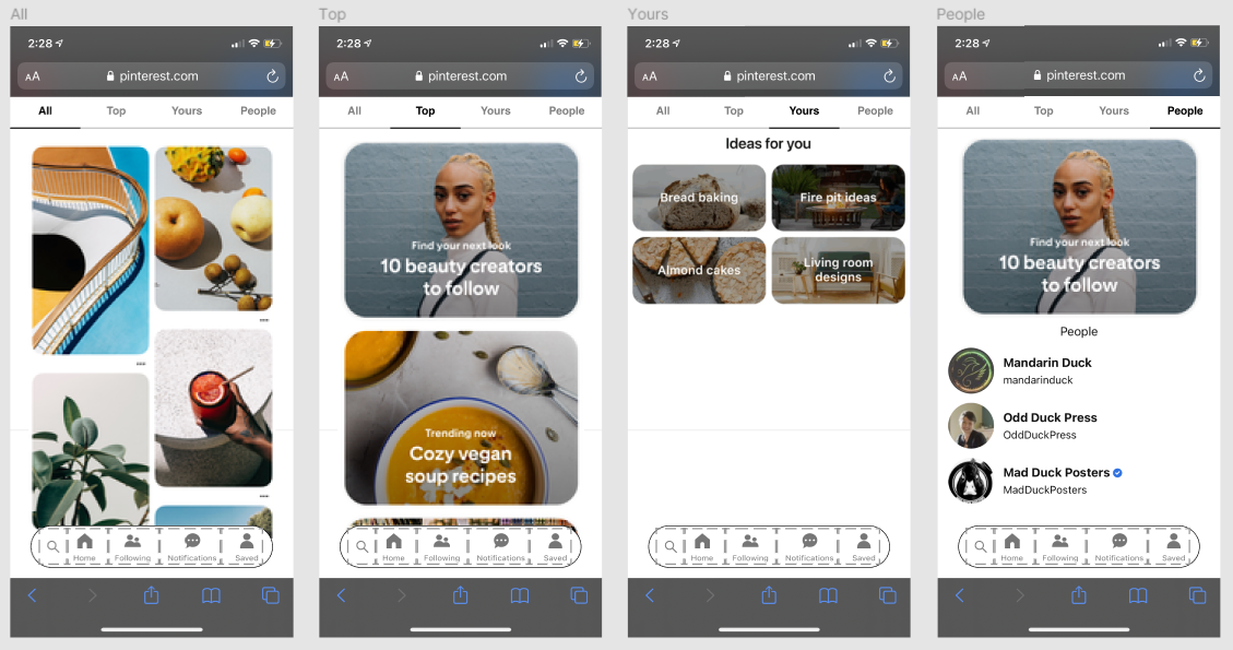
However, there were also problems that users came across. First, they were unfamiliar with some features because they were hard to find. Some users couldn't easily figure out how to create notes, edit pins, or move boards. Second, the overall layout is overwhelming and can lead to information overload. Ultimately, it means some features are getting ignored. Some users ignored the tabs and mostly used search for their needs. The user familiar with the app used the “For you” tab for inspiration. In the search component, all of the users exclusively used the search bar to look up things and ignored many of its other features.
Component Redesign
There were problems in many areas, so finding a single area to redesign was a dilemma. Changing the visual layout and any core user interactions would be too ambitious. We eventually decided to redesign the search section of the website. The biggest problem we discovered was that the search feature wasn't fully utilized.
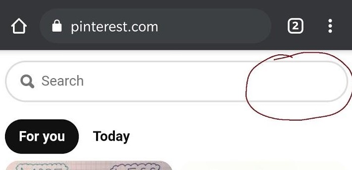
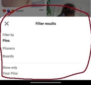
For example, none of the users noticed the drop-down to the right of the search bar to limit the search. This is because the home page doesn't include this feature. The design needs to be consistent (remove it or have it on all pages). Inconsistent design can confuse people. As a result, some people could miss out the filtering option, which limits their percepton of options to search for only pins, only pinners, or only boards.
Its filtering option is weak. Users can't search for popular pins or the latest pins if they wanted to. There should be some sorting options (e.g. sort by latest pin saved) and other filters (e.g. filter to pins uploaded this month). Improved filtering help people find content they like faster.
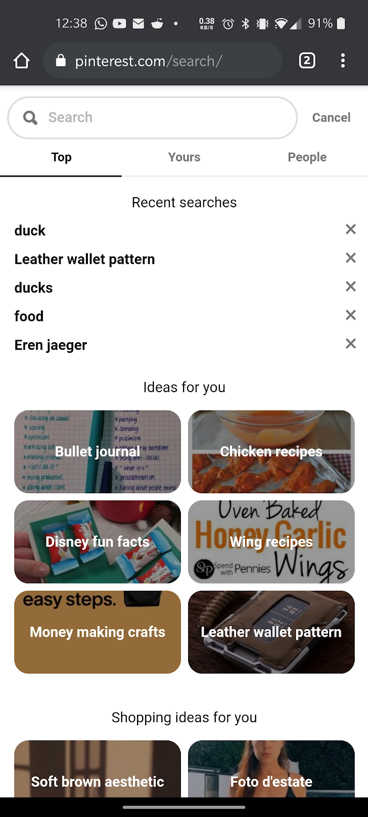
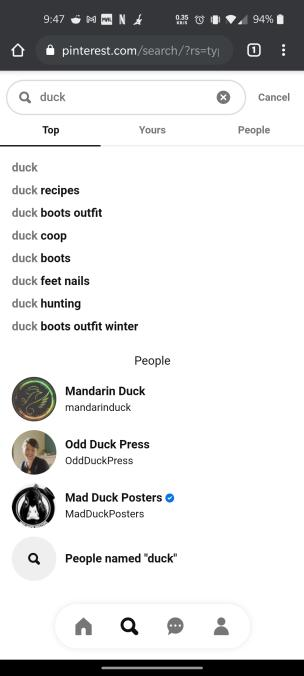
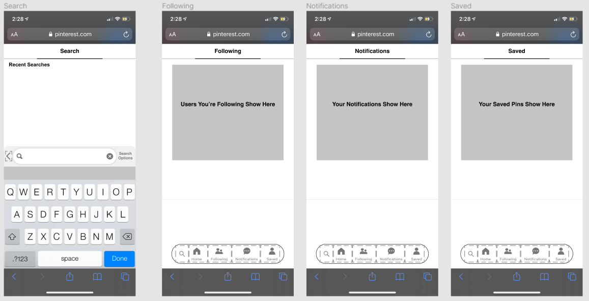
Some users ignored the suggestions in the search component because there are other options (“For you” page, “Today” page, “Following” page, “Notifications” page, etc.). Additionally, most users didn't bother to scroll down in the search component because users don't know at first glance that they can scroll for more content. We also noticed that users don't use suggestions when they didn't know what to search for. Our users mostly thought of a topic before searching. If users wanted to narrow their search, they would click on the tabs below the search bar. Otherwise, they would type out what they want to narrow. Based on this, we consider adding search suggestionss, but we believe the search section is something users will unlikely use there are other, more accessible options that provide suggested content. By removing search suggestions irrelevant to the search, we can use the space more efficiently (e.g. bigger sections, new features, less clutterred).
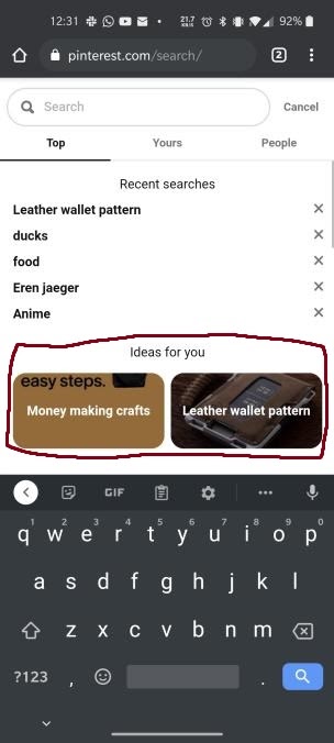
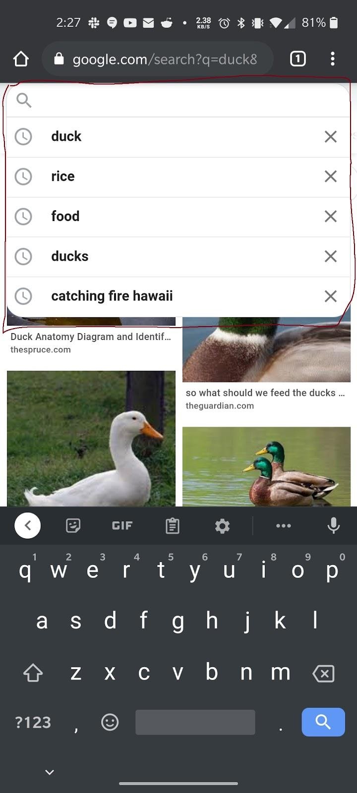
There is an inconsistency in the search window in terms of not searching anything and typing anything. Typing anything on the search bar dismisses the suggestions and recent searches. It also shortens the search window (can't scroll down). The size inconsistency can confuse users. We recommend that when there's anything in the search bar, it should keep the same size as it was before to keep consistency. With that extra space, it would be interesting to see an image preview of whatever the user wants to search for. Sometimes, people aren't sure what they're searching for, so having an image preview helps significantly.
Competitor Analysis
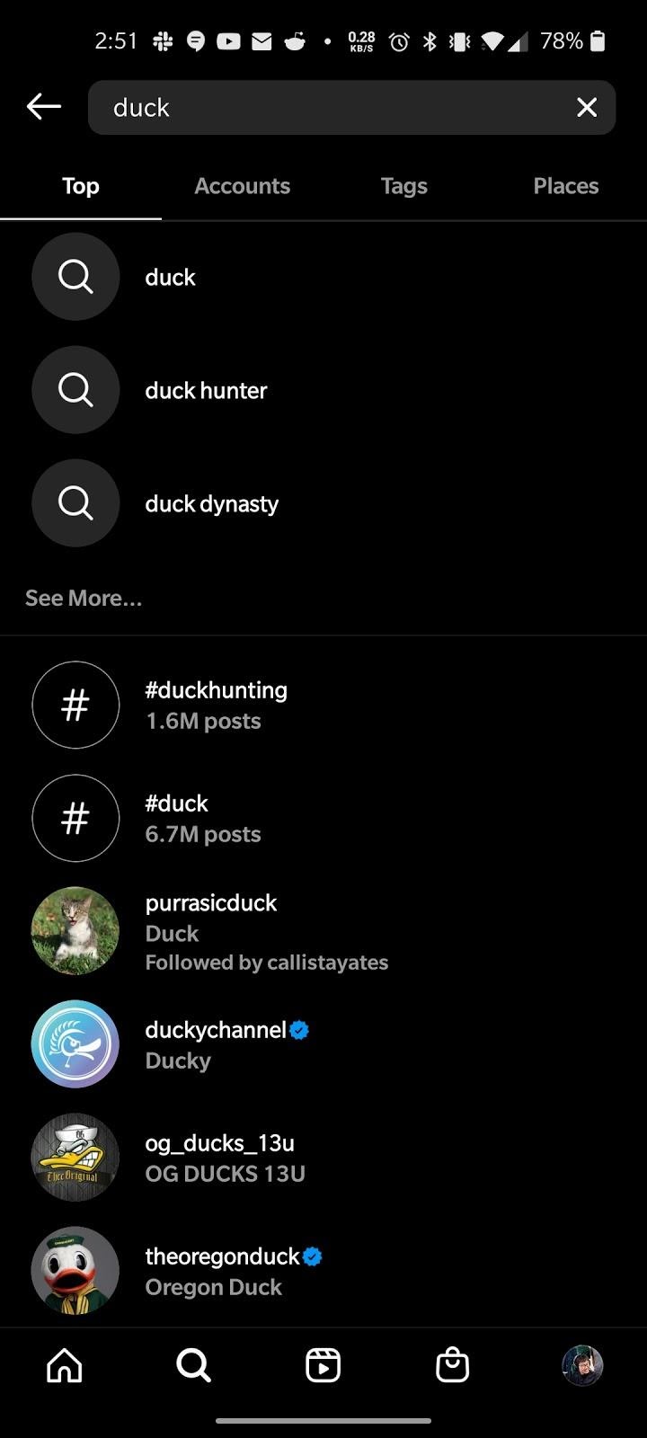
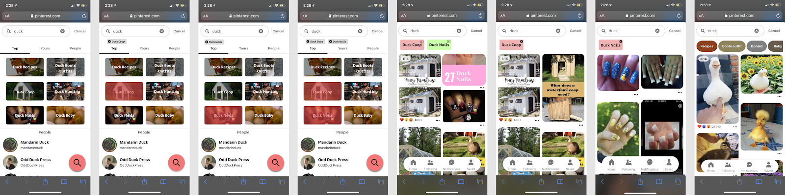
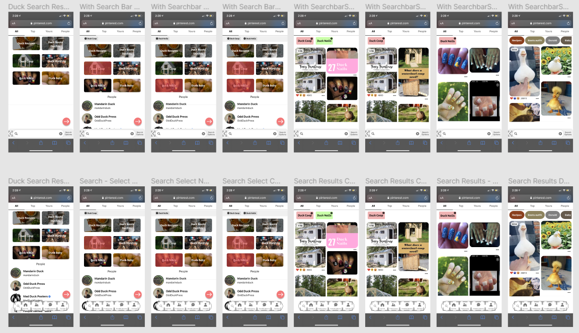
Instagram has a unique way of showing trending searches. In the image below, the search bar tells the user to search for “jam session”. However, it changes to a different trending search every few seconds. In Pinterest's search component, a user has to scroll down to find the Popular section. Since Pinterest is used to get inspiration, Pinterest could use the concept of blinking random ideas based on user preference. Instagram also shows relevant topics and searches in the Top section.

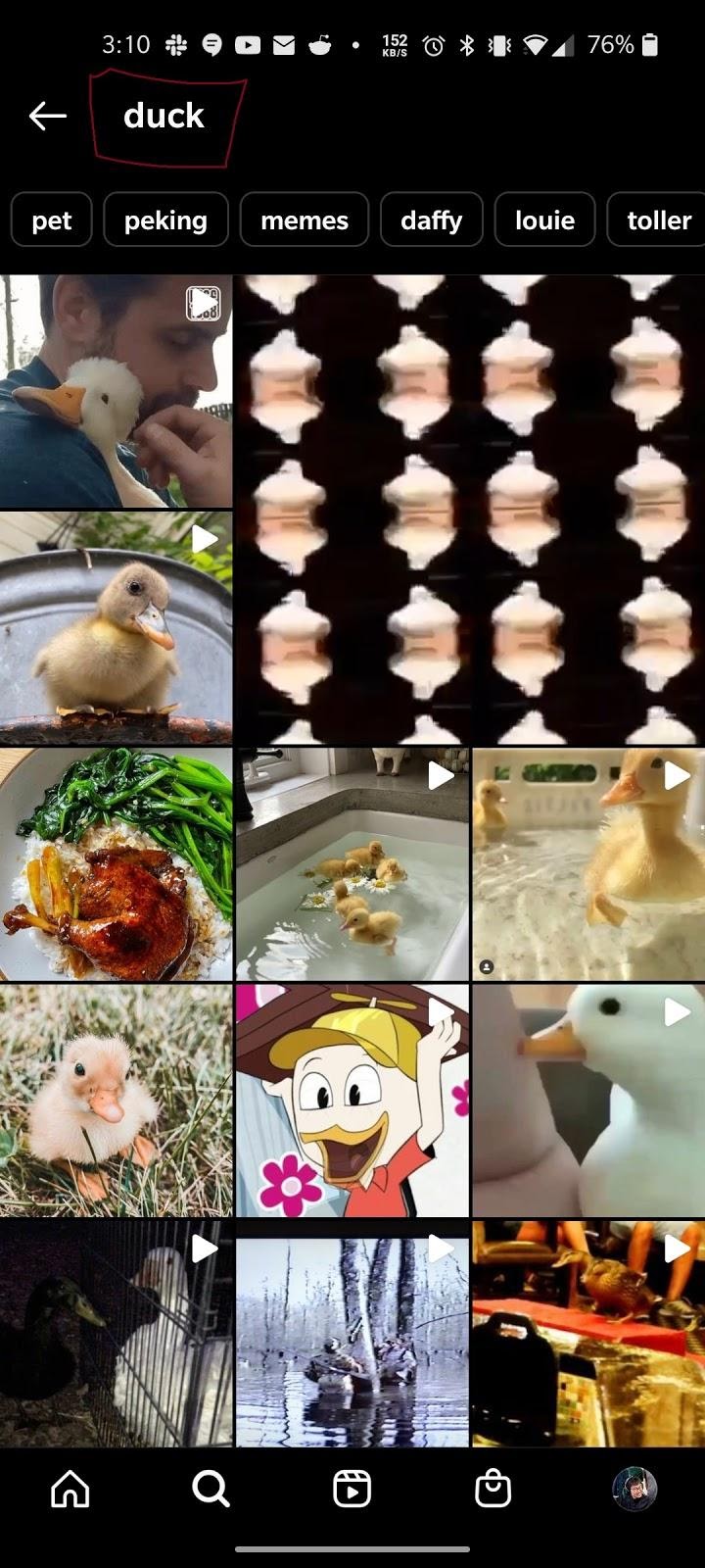
As shown in the left image, Instagram doesn't give search suggestions while typing something out. Instead, it waits for the user to press enter and see what the best results are, based on who they follow or what people tend to pick. In this area, the user can either scroll down endlessly. If a user wants to find a specific tag, they go to the tag section, then scroll down until they find a tag that is relevant to them. If a user clicks on the top result of the search results in the left image, they will be in the right image. The problem with the right image is that the user can click on the suggested keywords to narrow a search, but the user can't edit or add their own keywords themselves.
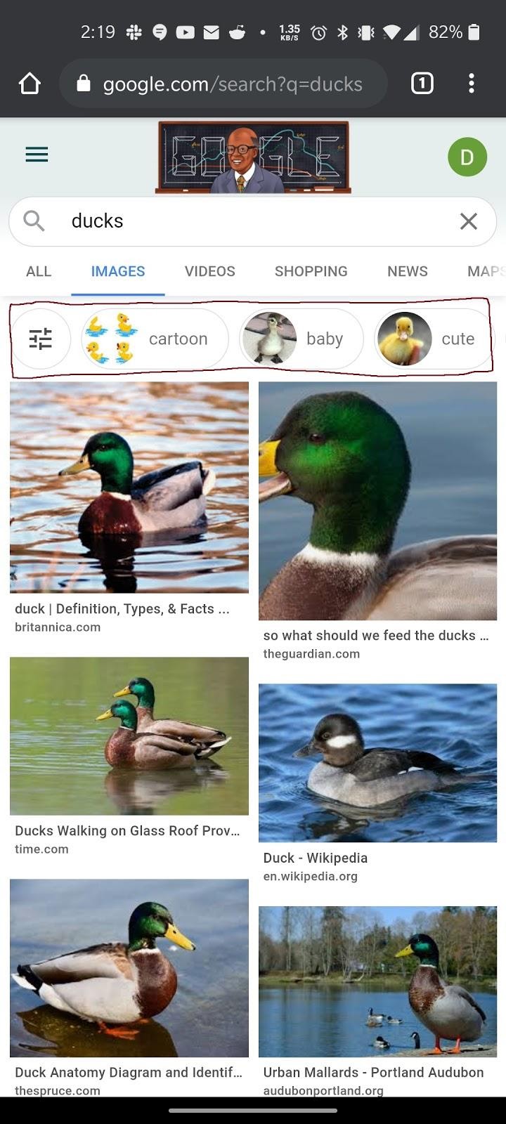
Google Images
Google Images' search component is used to its full potential. It is simple, yet powerful. In the image below, Google Images only provides recent searches because they know a user would either search for something new or go back to an old search if needed. The user would research beforehand then search those images in Google Images.
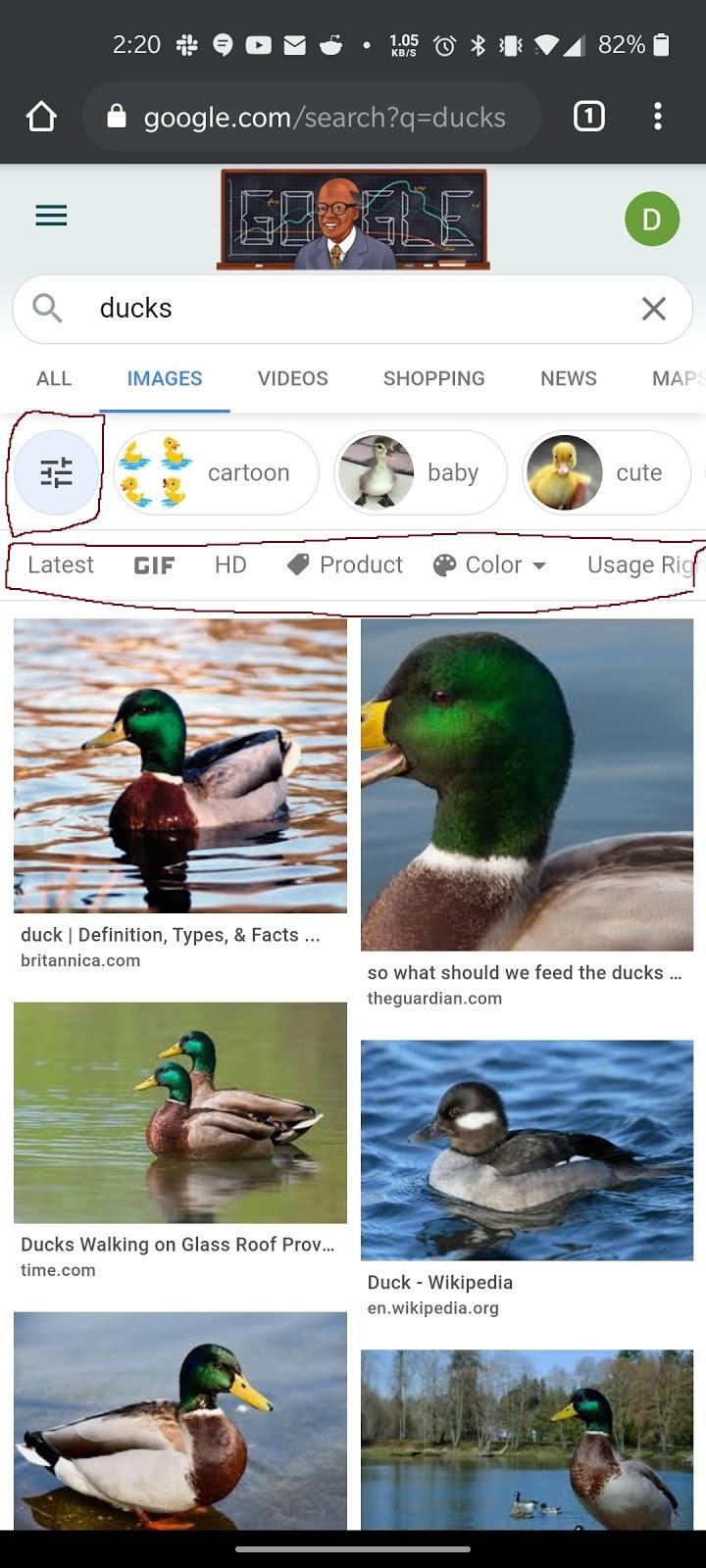
In the image below, the section below the tabs shows thumbnails and suggestions to help narrow down a search if needed. It also has horizontal scrolling, which creates more space for users to look at images. The search suggestions are all based on relevant user searches. The horizontal scrolling feels like the right amount of suggestions (not endless but not too short). If suggestions weren't enough to narrow down the topic, the user would type additional terms.
Compared to Pinterest, there are also more filtering options. Sometimes, a user wants to see the latest images. Sometimes, a user wants to only see high quality images. Sometimes, a user wants to use an creative commons image. These filters are used to narrow a search in a more technical manner (e.g. image dimensions).
Reddit's search component fixes some of the problems that Pinterest has. One, they make it as simple as possible while catering to enough of the users. When the search bar is empty, users are prompted to search or to look at trending. With Pinterest, there's too much information going on, like “For You” or “Popular in Pinterest”. The use of the search is also a lot different than in Pinterest. In Reddit, people tend to use the search option to either find a specific subreddit (a topic or community they're interested in) or to search up trending topics. The point of Reddit is to keep up to date with specific topics that you're interested in, and the search component supports that.
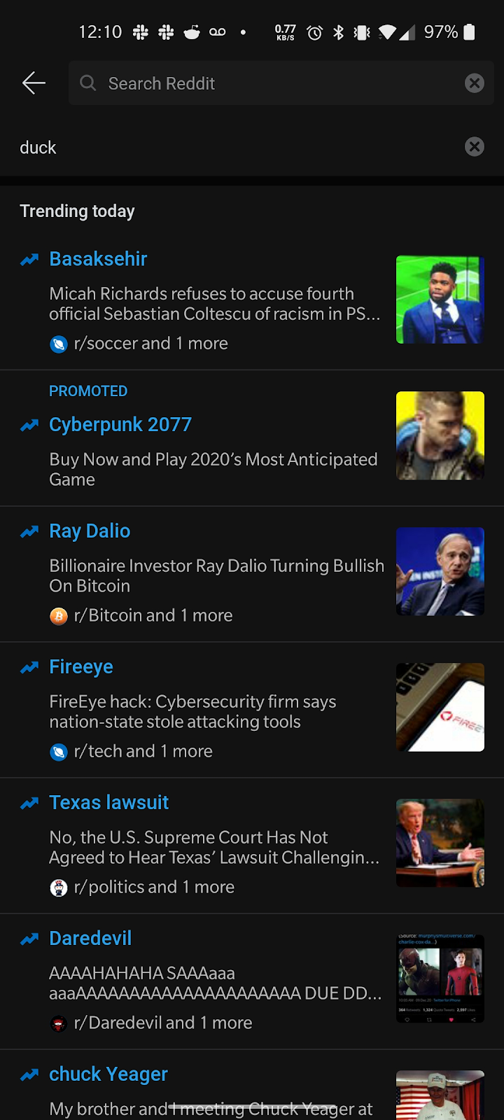
When searching something, Reddit suggests subreddits. Users can quickly see the icon and the number of members. The equivalent of this for Pinterest would be boards. Users can quickly gauge which of the subreddits is relevant to them and click on it. If a user doesn't want subreddits, they can click “Results for” or press enter for other information. If Pinterest has a feature that shows popularity for an item in the search bar, some users could glance at the more popular thing for as a potential source of inspiration.
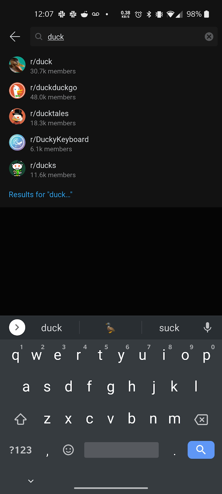
Reddit's search component includes a “Sort By” option. This helps a lot when users want to find things outside of the default option (“relevancy”). For example, users in the UCSD subreddit might want to find the top post in the whole Math 183 situation to understand more about it. Pinterest would greatly benefit from a “Sort By” option because users can find inspirations from popular things, trending things, latest things, and even the oldest things.
Sketches
These sketches are drawn by Ryan Wey. I pitched in my ideas from my component redesign and competitor analysis.
Sketch 1: Top Search Bar with Image Previews as Selectable Filters
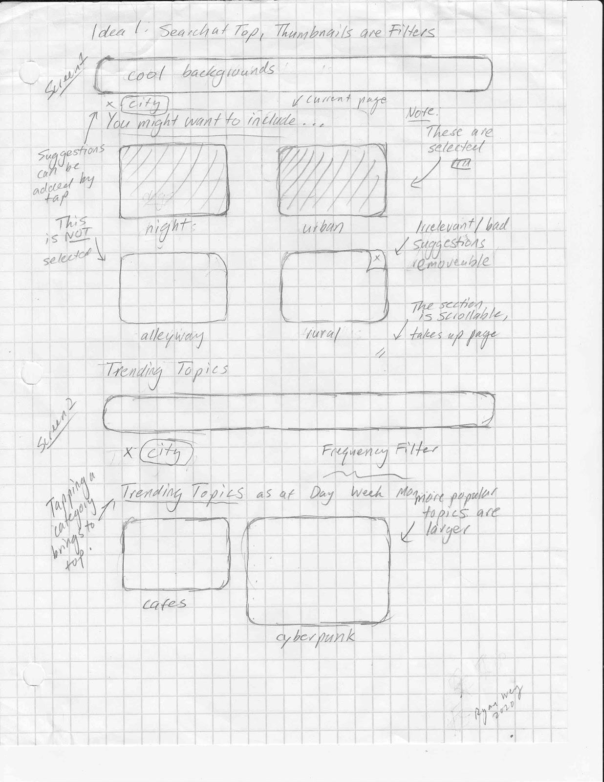
We changed image previews in search; previously they were one-way, click-through links to access an algorithmically generated feed. Users tend not to use these, yet many wanted more pictures to be visible and improved search filtering. Making the image previews into categories that users can select to refine a search is a fair compromise. 'Search first' users can still search their desired topics easily. However, more content from any one category of suggested content is more visible in this design. Users might find new content categories while searching, as opposed to having to deliberately look for it in their homepage.
Sketch 2: Persistent Search Bar with Live Updates
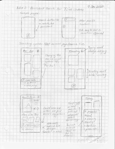
This sketch mimics the placement of a floating overlay, like on mobile. However, this time it is only the search bar. When the user searches, the current page/category will respond to the search. Tapping the title will change categories. Swiping up will go into search details.
Sketch 3: Search on a Seperate Tab
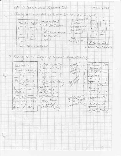
This sketch considers frustration for having to reach to the top of the screen to access features. Therefore, the top part of a screen should be used for reading. Search is now at the bottom. It can be a separate screen that is accessed on tap. It could also be accessed via a left/right swipe: this is similar to the Google Feed on Android devices and the 'Today' screen on iOS. On phones with notches, moving buttons down has another benefit: they are no longer obscured and use the space around the notch well. The area to the left/right of a notch can be used for infrequent accessed buttons like 'Settings'.
Sketch 4: Search as a Sort of Homepage
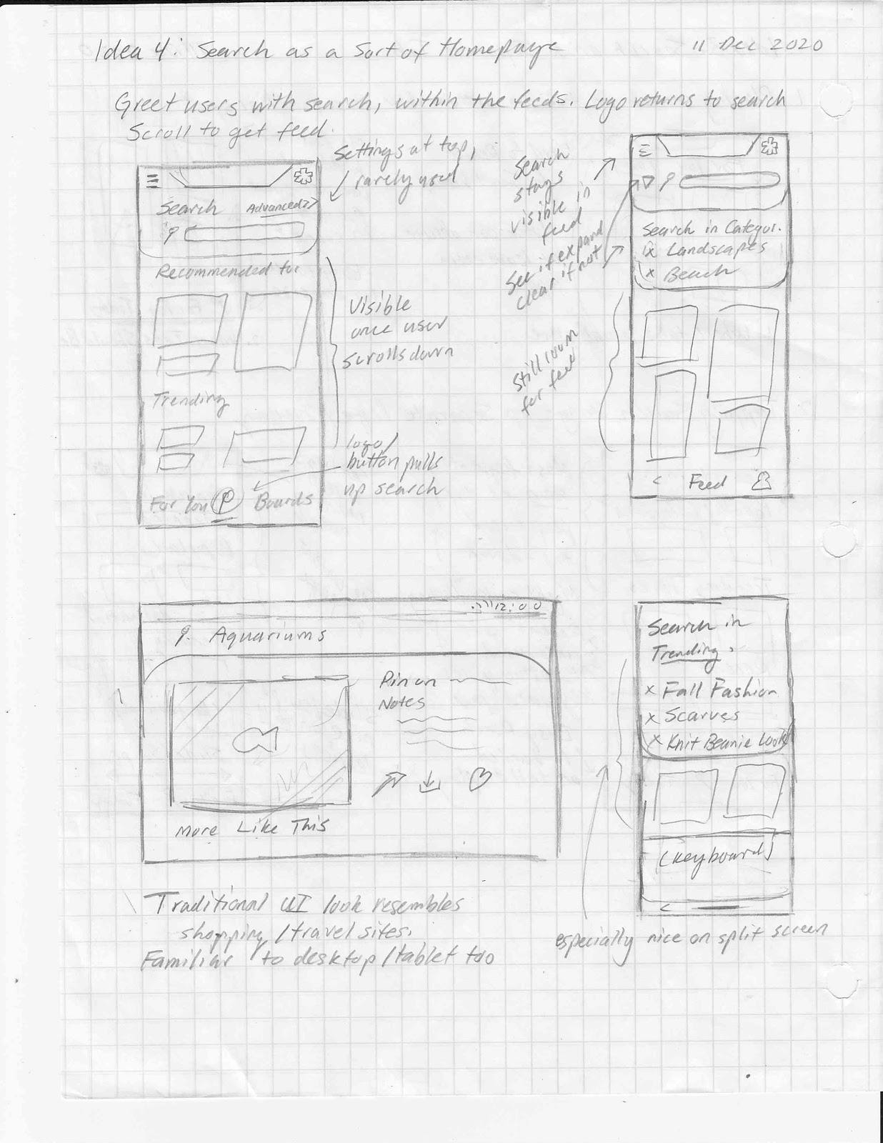
This sketch considers the design from shopping, travel, and some image board/forum sites. These have the search bar across most screens as a core interaction, encouraging users to use the search. This allows augmenting it with other content, so that search-preferring and feed-preferring users are not necessarily separated nor alienated.
Prototypes
We made two prototypes. Both prototypes were designed to keep Pinterest's design, while focusing on key differences in how users might approach the search component.
Prototype 1
Figma Prototype 1Prototype 1 focuses on making the filtering more intuitive and easier to access. We removed the Pinterest jargon and made it so users can filter out more exclusively.
Prototype 2
Figma Prototype 2Prototype 2 focuses on making the filtering more easily accessible by moving many icons and functions around to make it more intuitive. For example we moved the search component to be a toggeable button witth the rest of the shortcuts.
Prototypes
We used similar testing methods as the previous one, but we got four new testers. In order to see if our prototypes were effective, we made each user use the search componenet of one prototype and Pinterest's search component. We gauged their opinions and how fast they were able to use the search bar, especially for the task including two filters. If a user had trouble using the prototype or the actual website, we took note of that.
We made a group of questions and tasks in order to gauge this difference. Some of these questions and tasks included:
- A person's familiarity with the app (e.g. Do you use Pinterest?)
- Using the redesigned search component from the prototypes and Pinterest's search component
- Impressions of the prototype (e.g. Did you notice anything different?)
Most users in our second user testing prefer the original search component as a result of the bugs from the prototype and the simplicity of the original. However, there were strengths to our prototypes. Most users enjoyed the ability to stack filters/tags on top of each other. In Pinterest's website, users had to type out each filter in quotations in order to filter the way it was in the prototype. In prototype 2, there were quality of life changes that made users not move their hands as much as the original.
Conclusion
It was interesting to dissect a popular app's component and redesign it. We made sure everyone did their part and met the deadlines we set ourselves to do. Although most of the users prefer the original design, there were changes that users enjoyed and needed. It also made my group realize that users don't need to utilize the full functionality if the core functionality serves them well enough. Despite the short time, it was an eye-opening experience. For our prototypes, we emphasized design choices that would benefit the user.
In the end, we recommend that most of Pinterest's design can remain the same. However, things can be reorganized to create a more streamlined user experience. Pinterest could also benefit from additional features that other websites have done in order to give more options for users.